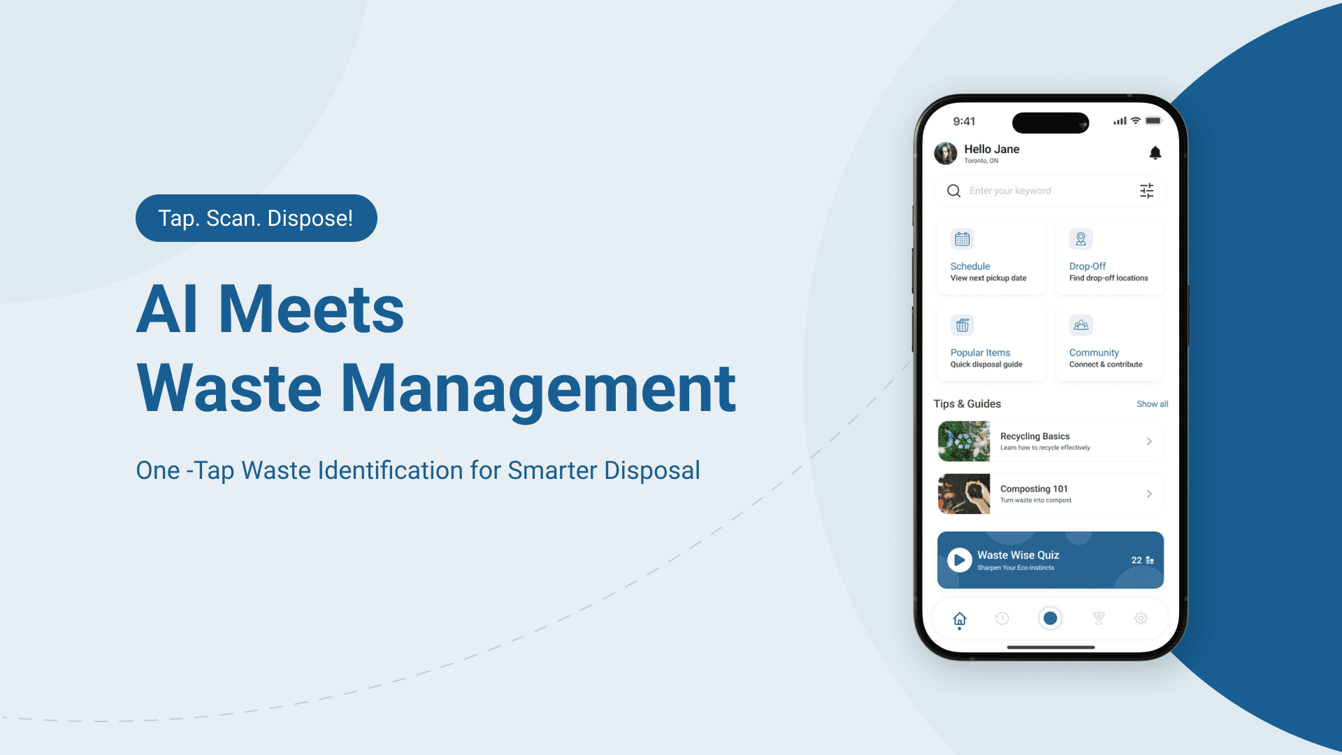
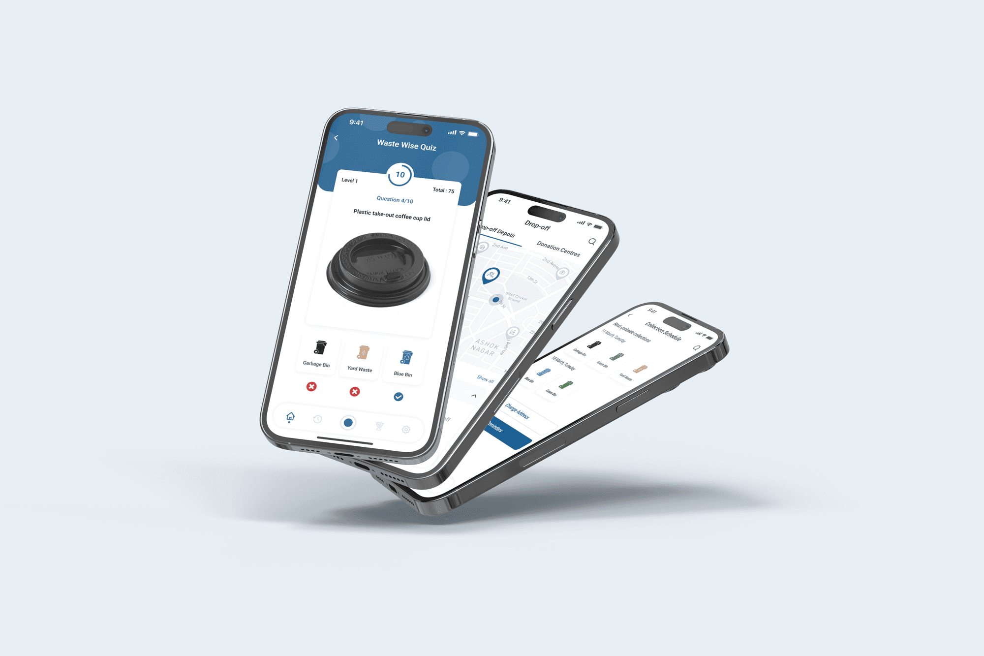
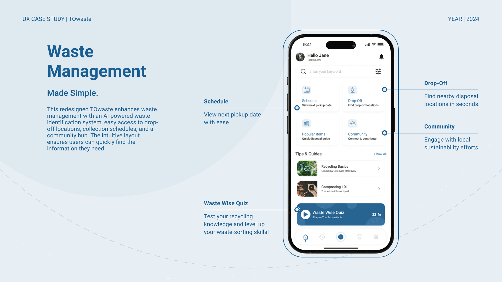
TOwaste – Simplifying Waste Sorting for Toronto Residents
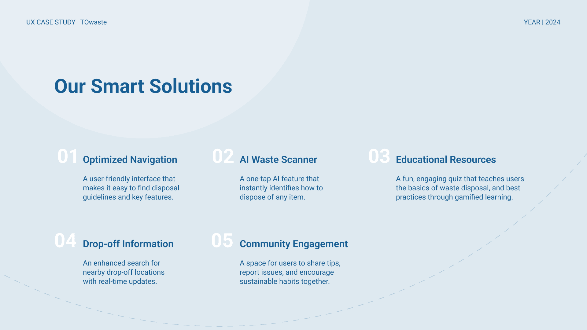
TOwaste is a mobile app designed to help Toronto residents dispose of waste correctly and efficiently. Through AI-powered item scanning, quick access to disposal guidelines, and smart tools like pickup schedules and drop-off locators, the app removes the guesswork from waste management. Built with simplicity and clarity at its core, TOwaste empowers users to make sustainable choices with ease, turning a frustrating task into a seamless, informed experience.
Sustainability
TOwaste (Redesign Concept)
Public Service, Smart City Tools
UX/UI Design,
User Research, Accessibility,
Behavior Change
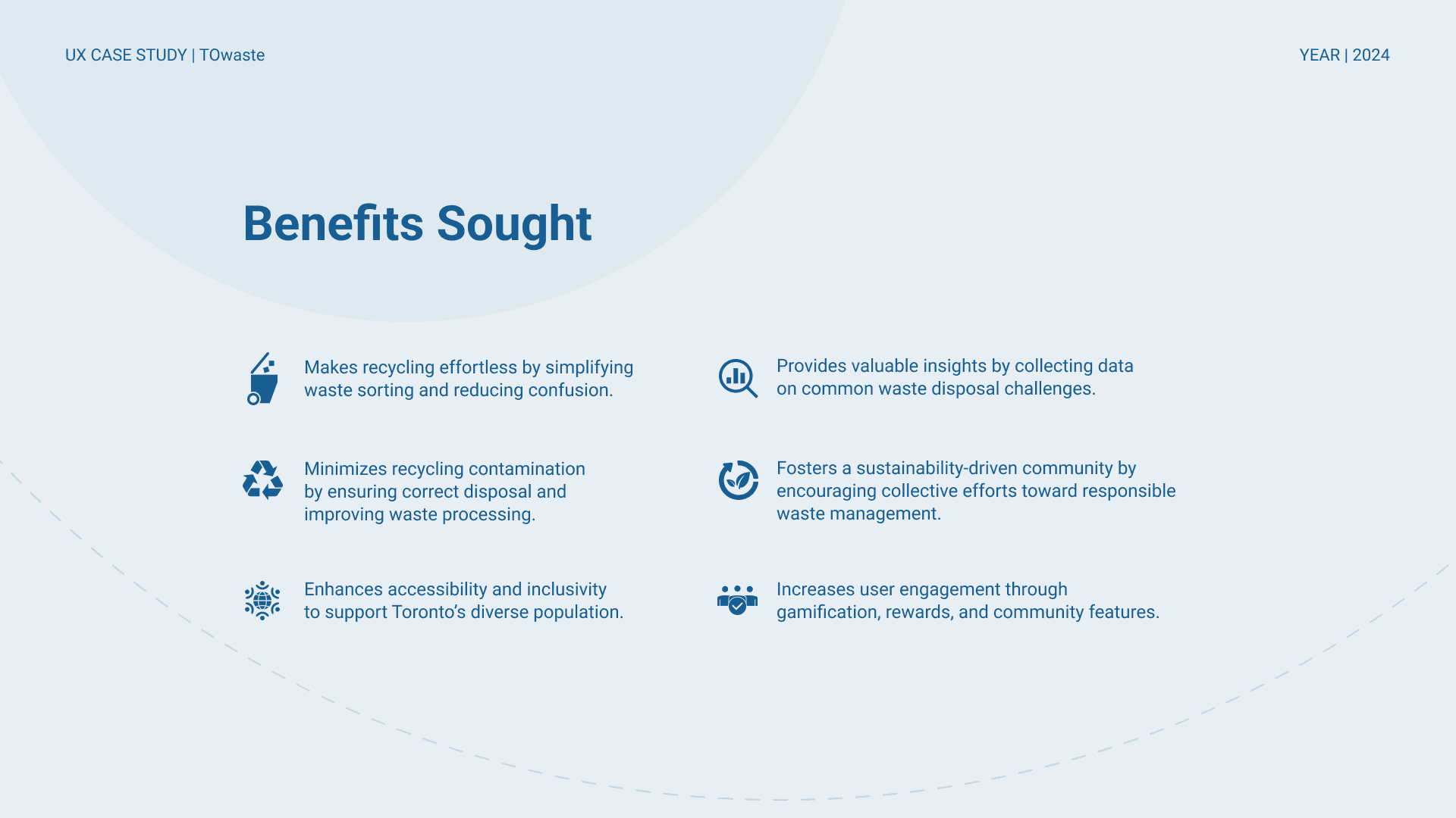
Empowering Toronto residents to manage waste more efficiently through clear, intuitive digital tools
Figma, Illustrator, Google Forms
Challenge
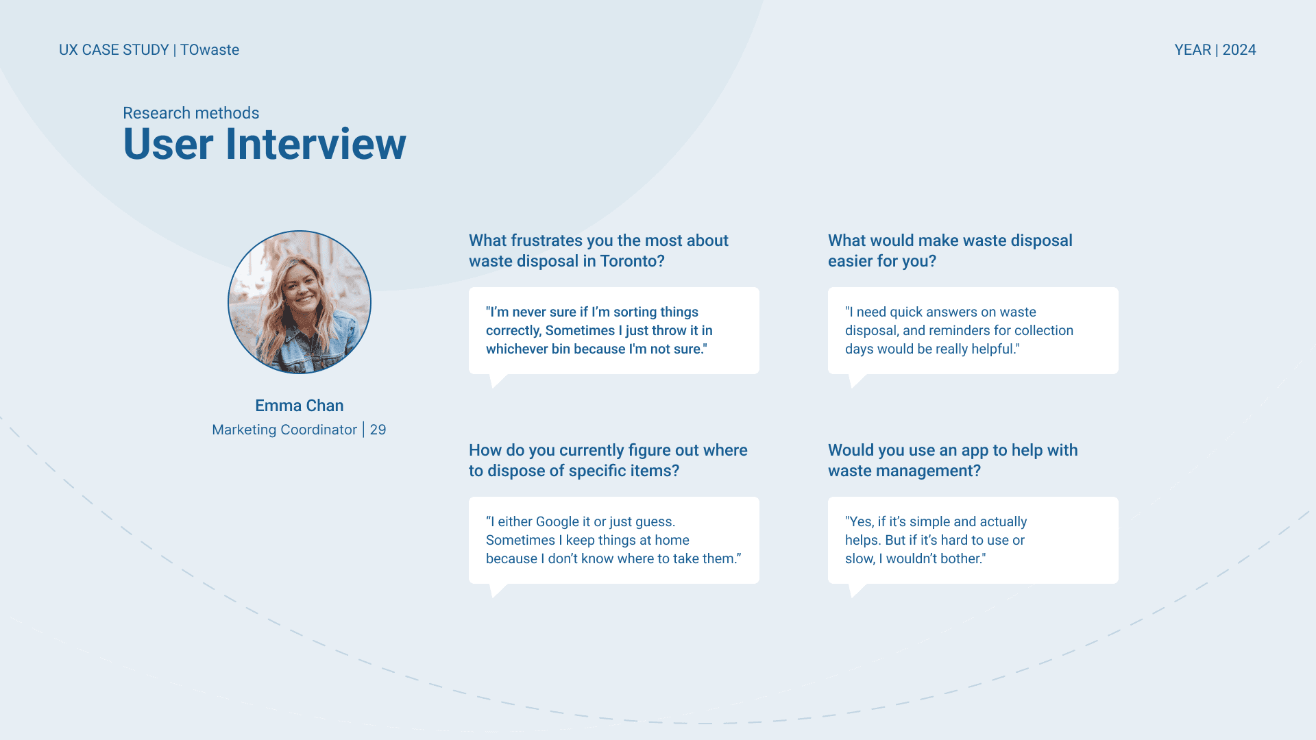
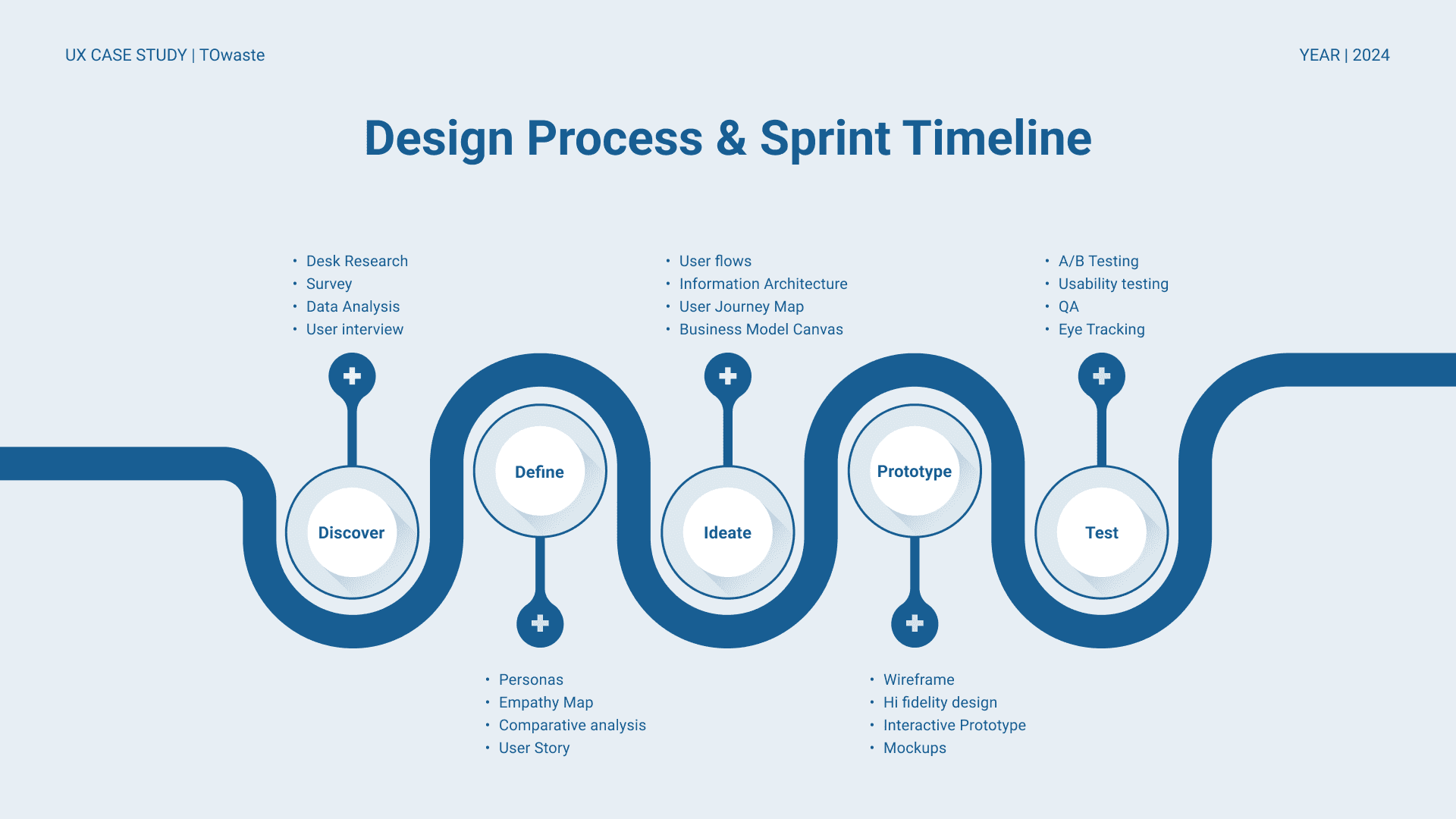
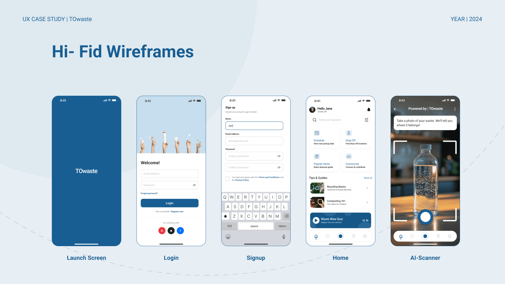
One of the biggest challenges I faced was simplifying a complex system, "waste sorting" for everyday users who may not be tech-savvy or familiar with municipal guidelines. It was also difficult to ensure the design stayed intuitive while introducing features like AI scanning and community support. Balancing the depth of information with a clean, minimal interface took multiple iterations and careful usability considerations. Conducting research and narrowing down real user pain points also required a lot of filtering and thoughtful interpretation.
Results
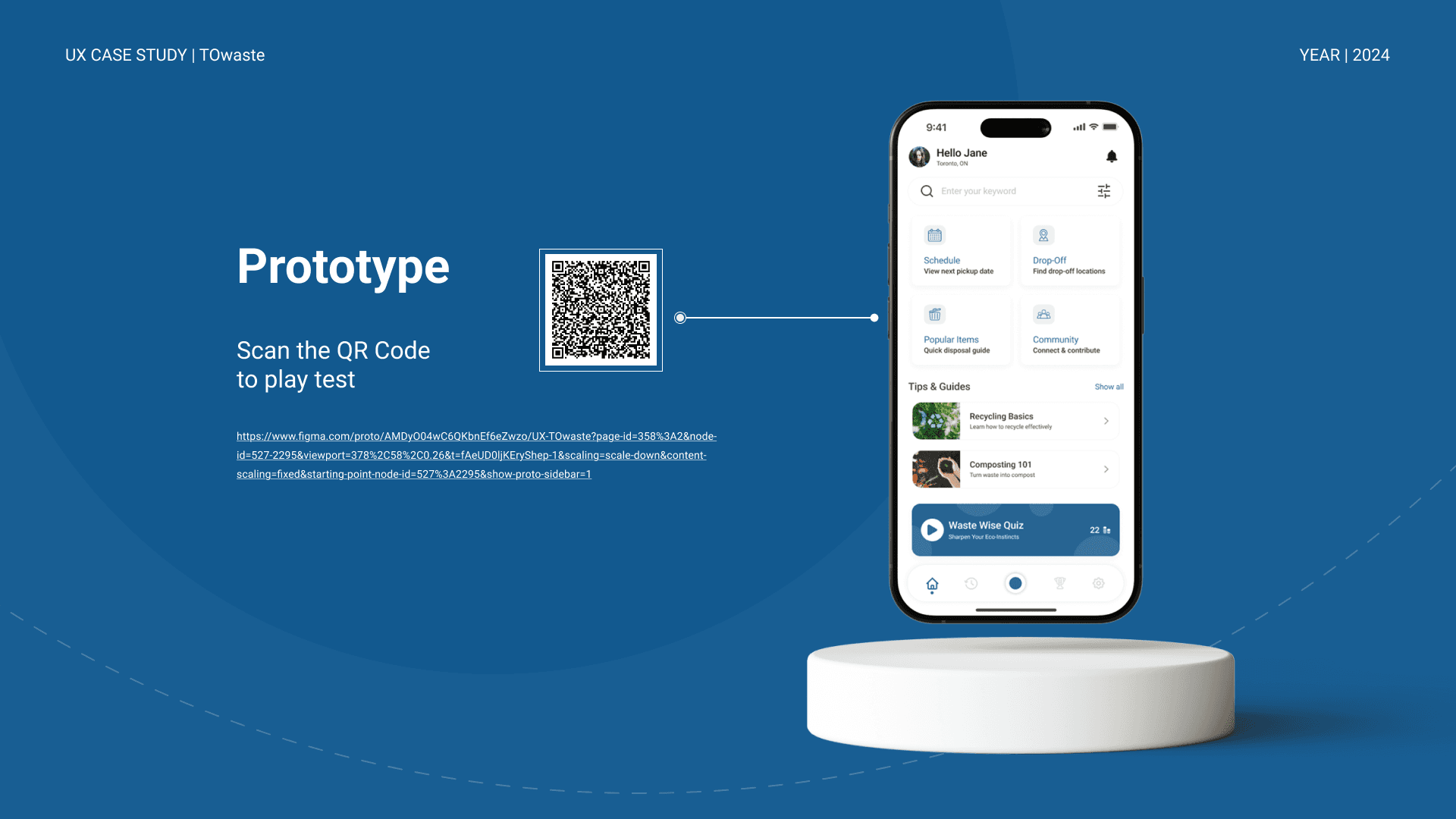
Through this project, I was able to design a solution that makes waste sorting easier, smarter, and more approachable for Toronto residents. The final prototype received positive feedback for being simple, clear, and user-friendly. It successfully integrated AI support, educational tips, and local resources, all aimed at reducing user confusion and promoting sustainable behavior. This experience helped me grow in user-centered design and strengthened my confidence in turning complex problems into practical solutions.

Conclusion
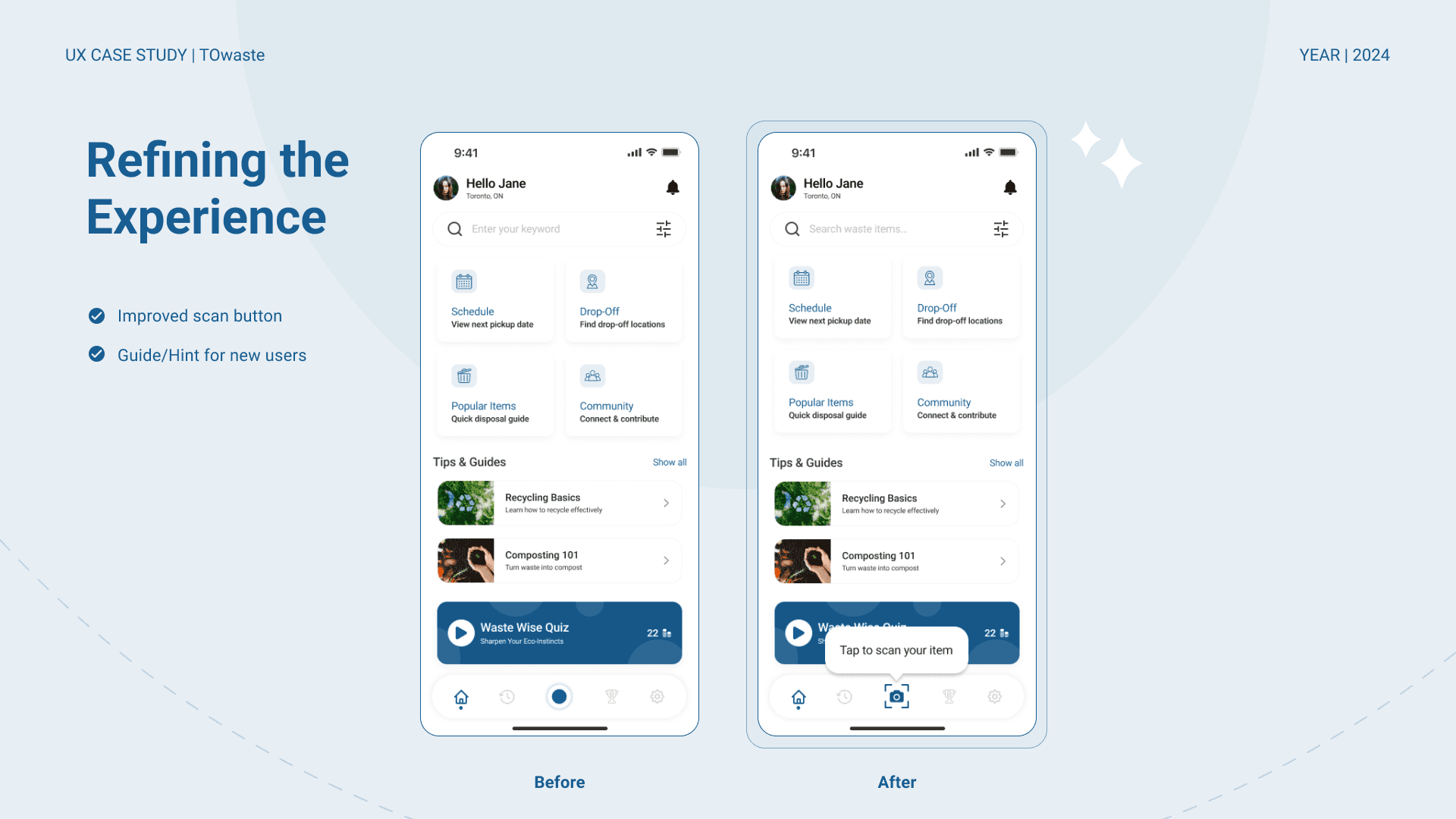
Working on the TOwaste app reinforced the importance of simplicity in user experience. Through research and usability testing, it became clear that users want quick, effortless solutions for waste disposal. The AI scanner was a strong addition, but ensuring its visibility and ease of use required iteration.
Balancing information and usability was another key learning. While education is essential, overwhelming users with too much content can be counterproductive. Instead, integrating features like quick tips and interactive guidance helped make the experience more intuitive.
Moving forward, refining onboarding, improving feature discoverability, and streamlining navigation will enhance the app’s impact. This project highlighted how small design choices significantly shape user behavior and adoption.